Most bracelets do not need five competing colours. One main shade, a quieter partner and a little metal or pearl is usually enough. The combinations below are starting points, not formulas; swap the finish and the same colours can move from beachy to evening.
Cool combinations that still have warmth
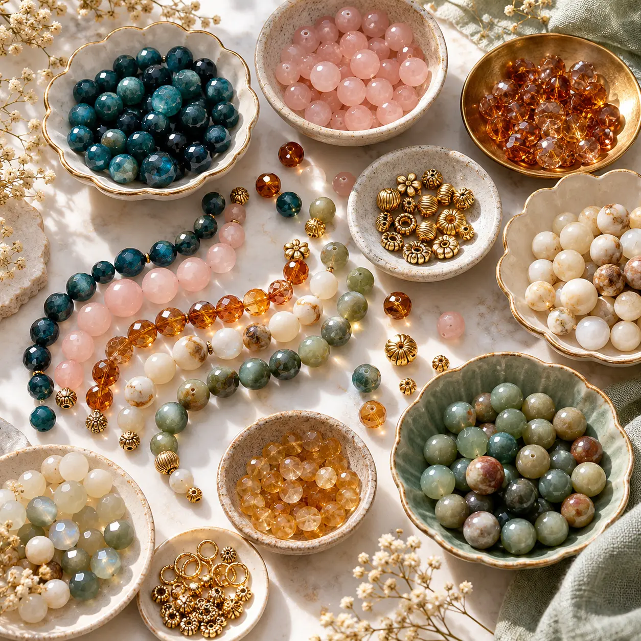
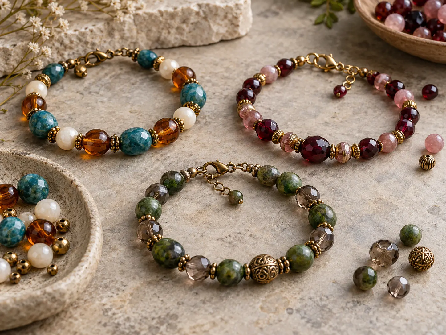
Deep teal, pearl and antique gold is rich without becoming dark. Let teal do most of the work, use pearl as a pause and keep the gold to small spacers or one clasp.
Lapis blue, white and gold feels sharper. It suits clean round beads and simple repeats. Lavender, moonstone and silver is quieter, with translucence supplying the interest.
- Deep teal, pearl and antique gold
- Lapis blue, white and gold
- Lavender, moonstone and silver
- Sea-glass blue, clear crystal and silver
Warm palettes that do not turn sugary
Blush, sage and warm cream works because the green stops the pink from becoming too sweet. Burgundy, blush and pearl uses the same idea at a deeper value and looks especially good with brushed gold. Mirror-bright spacers can be too sharp here.
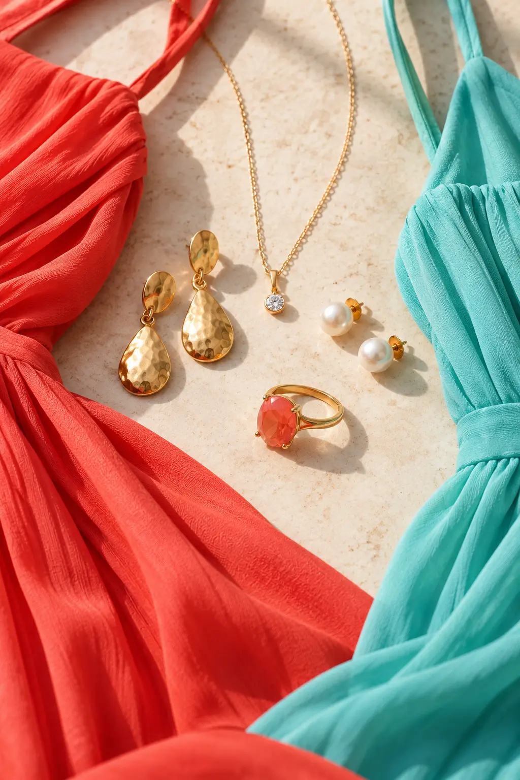
For something sunnier, coral, aqua and natural wood has the energy of a holiday bracelet. Smooth, pale wood gives it a cleaner finish; dark rough beads make it feel more rustic.
- Blush, sage and warm cream
- Burgundy, blush and pearl
- Coral, aqua and natural wood
Earthy colours need one clear note
Amber, smoky grey and brass can become muddy if every bead is translucent and mid-toned. A few opaque smoky beads or a defined brass spacer give the eye somewhere to stop.
Terracotta, turquoise and sand is more direct. Pick terracotta or turquoise as the lead colour instead of splitting them equally. Olive, honey and ivory is softer and works well in matte finishes.
- Amber, smoky grey and brass
- Terracotta, turquoise and sand
- Olive, honey and ivory
Two darker palettes for evening
Forest green, rose quartz and gold sounds unexpected, but the pale pink lifts the green and prevents the bracelet from looking too heavy. Use rose quartz sparingly if the green beads are large.
Black, champagne and antique gold is the easiest evening combination here. The champagne beads need not be crystal; satin-finished glass or pale smoky quartz gives a quieter result.
- Forest green, rose quartz and gold
- Black, champagne and antique gold
Finish changes the same colours
Matte beads soften bright colours. Faceted glass adds small flashes of light and can make a muted palette feel dressier. Pearl coatings sit somewhere in between, although they can scratch if metal spacers rub against them.
Clear beads are not truly colourless once worn. They pick up skin tone, clothing and whatever sits behind them, so check the loose beads against the fabric you expect to wear.
Test the palette before stringing
Set out enough beads for one complete repeat, including every spacer. Step back and take a phone photograph in daylight. The screen often exposes the colour that is taking over or the metal that is too bright.
If the mix still feels busy, remove one colour before adding another. A bracelet usually becomes more wearable when the palette is edited, not expanded.